Paint my Room - Try wall color
- 4.1
- Rating
- 1.00M
- Installs
- Free
- Price

 Analysis by App-foxy
Choosing a wall color is easy when you are looking at paint cards in a store and surprisingly difficult when you are standing in your own room. A shade that looks calm on a small sample can feel heavy across a whole wall, while a color that seems too bold on paper may actually make the space feel warmer. Paint my Room - Try wall color, from Try the Colors s.r.o., is built around one focused idea: previewing a different wall color in your room before committing to paint.
I found the concept useful because it changes the decision from an abstract guess into a visual comparison. Instead of imagining how a color might behave beside a sofa, bed, shelf, or window, you can use the room itself as the setting. That does not replace a real paint sample, but it gives you a faster way to narrow down the choices that deserve closer attention.
As a free house and home app for everyone, it is approachable for renters planning a temporary refresh, homeowners preparing a larger project, and anyone who keeps changing their mind in the paint aisle. It is available for Android devices running at least version 7.0, and the current version is 3.3.132. The app has reached over a million installs and holds a 4.0 average from around twenty thousand ratings, which suggests that the simple visual-preview idea has found a substantial audience.
You May Also Like

 Blood Strike: 2.5 Anniversary
Blood Strike’s Loadouts Turn Every Drop Into a Tactical Gamble
A close look at Blood Strike’s custom loadouts: how fast access to signature weapons reshapes its battle royale rhythm, rewards preparation, and narrows the gap between fights.

 Pandora - Music & Podcasts
Pandora’s Music Is Easy to Start, but Harder to Recover
Pandora’s strength is its low-effort path from a seed to a station. Its weak spot is how much confidence it asks you to place in connection, setup, and quiet recovery.

 8 Ball Pool
 Is Built on Rivalries, Rematches, and Routine
A close look at the rivalries, rematches, shared routines, and unanswered safety questions that turn a quick pool match into a persistent mobile community.

 Samsung Music
’s Quiet Strength Is Playing What You Already Own
Its reach comes less from spectacle than from dependable access to a personal library. That simplicity is both the app’s strongest retention engine and its ceiling.

 AccuWeather: Weather Radar
AccuWeather Review: A Quick, Clear Forecast for Everyday Decisions
For everyday plans, the best forecast is the one you can understand quickly. AccuWeather makes rain timing, radar, and local conditions easy to act on, with a few trade-offs.

 Hill Climb Racing
Why Hill Climb Racing Still Turns Crashes Into One More Run
A tiny car, a bumpy hill and one more upgrade: Hill Climb Racing keeps resurfacing because its simple chaos makes every near-miss feel personal.
More From Our News Desk
View All News


Seeing the wall instead of imagining it
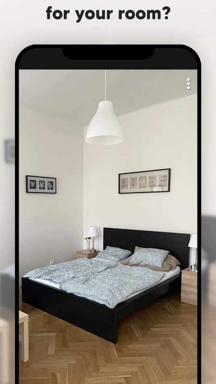
The central capability is wall-color visualization. You provide a room image, select the wall area, and try different colors against the existing surroundings. The important part is not merely seeing a colored rectangle. The value comes from seeing a proposed shade in relation to the room’s furniture, flooring, lighting, and decoration.
That distinction matters. A color can look attractive in isolation and still be wrong for a particular room. A cool gray beside blue furniture may make the space feel colder than expected. A warm beige against dark wood may create a comfortable balance, but the same beige could look dull in a room with little natural light. The preview helps expose those relationships before you buy paint.
I would describe the app as a decision-making tool rather than a complete renovation planner. Its strength is the first question most people ask: “What would this room look like if the wall were another color?” It is less suited to calculating paint quantities, planning furniture placement, or replacing a physical sample under changing daylight.
The developer, Try the Colors s.r.o., keeps the purpose narrow, and that focus is helpful. You are not pushed into a large catalog of unrelated home-improvement tasks. The experience is centered on experimenting with wall color, which makes it easier to use when you already know the room you want to change but have not settled on the finish.
A practical way to test a room
I recommend starting with a clear photo taken from a normal standing position. Avoid an extreme wide-angle image if possible, because stretched walls can make the preview feel less trustworthy. Include the main furniture and the floor in the frame. Those elements give you a better sense of whether the color belongs in the room than an empty wall would.
Once the room is loaded, the useful habit is to test related shades in groups instead of jumping randomly from white to deep green to yellow. Begin with a few close options, compare them under the same image, and then move toward a stronger contrast only if the quieter shades feel too flat. This makes the visual differences easier to judge and prevents the process from becoming a collection of disconnected screenshots.
Pay attention to edges. Corners, door frames, shelves, curtains, and wall decorations can complicate any color overlay. If the selected area is too generous, the preview may color an object that should remain unchanged. If the selection is too narrow, parts of the wall may remain in the old color and distort your impression. Taking a little care at this stage is more valuable than testing dozens of shades quickly.
A useful trick is to compare the same color against two different photos of the room: one taken near a window and another from a less brightly lit angle. This is not a substitute for observing real paint at different times of day, but it can reveal whether your favorite shade depends too much on one lighting condition. A pale color that looks fresh in bright daylight may feel noticeably heavier in a dim corner.
I also found it helpful to save or show the strongest candidates to another person without explaining which one I preferred. That removes some of the emotional attachment that develops after repeatedly looking at one option. The app works best when it supports a short list rather than pretending to deliver a final answer by itself.
What the preview can and cannot tell you
The visualization is most reliable for judging broad atmosphere and color relationships. It can show whether a wall seems too dark beside your furniture, whether a warm tone complements the floor, or whether a bold accent would dominate the room. Those are exactly the questions that are difficult to answer from a tiny printed card.
On the other hand, a phone display is not a perfect color reference. Screen brightness, camera exposure, indoor lighting, and the original wall color all affect what you see. Paint has texture and reflectivity, while a digital preview remains a flat representation. I would never treat the app image as proof that a particular paint will look identical in person.
There is also a practical difference between coloring one wall and coloring the whole room. If you are considering an accent wall, the preview can help you judge its relationship with the remaining walls. If you intend to repaint every surface, remember that the visual impact will be much stronger than a single-wall image may suggest. In that situation, create several views or mentally extend the result across the room before deciding.
This is where a physical sample remains important. After using the app to narrow down your choices, paint a small test area or use a real sample card in the room. Check it in morning and evening light, beside the largest pieces of furniture, and near the trim. The app saves time and reduces uncertainty; it does not eliminate the final real-world check.
The everyday scenario where it earns its place
Imagine that I am preparing a bedroom refresh over a weekend. The walls are currently neutral, the bed has a dark frame, and I am considering a muted green, a warm gray, or a soft blue. Buying three paint cans would be wasteful, and relying on online room photographs would tell me very little about my own furniture. With this app, I can use a photo of the bedroom, compare those directions, and quickly see which family makes the room feel restful rather than crowded.
The same workflow works for a living room before guests arrive, a child’s room before choosing a playful accent, or a home office where the wall color needs to feel pleasant without becoming distracting. In each case, the benefit is not that the app tells me the objectively correct shade. It helps me reject unsuitable ideas early, while changing my mind is still free.
For renters, the app can be useful before asking a landlord about a repaint. A preview gives you something concrete to discuss instead of describing a color vaguely. For people selling a home, it can also help compare a personal favorite with a more restrained option. A dramatic shade may express your taste, but a softer choice might make the room easier for visitors to imagine as their own.
One less obvious use is coordinating several rooms. Take a photo of the hallway, bedroom, and living room, then test a small set of related colors rather than choosing each room independently. This can reveal when your favorite color works beautifully in one space but clashes with the view into the next room. The app is especially helpful for spotting those transitions before you buy multiple cans of paint.
Where the simple approach becomes limiting
The focused design also creates boundaries. If you want detailed renovation planning, exact material estimates, furniture visualization, or a full interior-design board, this is not the right tool. A broader home-design app may be better for arranging objects and exploring an entire room concept. Paint my Room is more direct: it addresses the wall-color question and leaves the rest to you.
The result can also require patience around complicated rooms. Open shelving, plants, wall art, mirrors, and patterned furniture make boundaries harder to interpret. A plain wall is easier to preview than a wall covered with objects. If you are expecting a perfect automatic transformation from one photograph, you may find the process less effortless than the short store description implies.
Another trade-off is the difference between visual confidence and physical certainty. The app can make you feel more confident about choosing a warm neutral, but it cannot reproduce the exact finish, sheen, texture, or changing daylight of the paint you will apply. This is not a flaw unique to this app; it is a limitation of digital color previews. The sensible approach is to use the visualization for selection, then use a real sample for confirmation.
The app is free to download, with in-app purchases ranging from $0.99 to $29.99 per item. That makes it easy to try without paying upfront, but I would still look carefully at what is available before building your whole workflow around paid options. For a one-room decision, the free experience may be enough for some people; users planning several rooms should decide whether the additional purchase is worthwhile for their needs.
Because the content rating is Everyone, the app is suitable for a broad household audience. A parent and child can compare colors for a bedroom, or roommates can use the same room photo to discuss a shared space. Still, the final choice should remain grounded in practical concerns such as cleaning, existing fixtures, and whether the selected color will continue to work after the novelty fades.
Small habits that make the results more useful
First, photograph the room before moving furniture around. That gives you an honest picture of the space you actually live in. A staged room may look attractive, but it can hide the visual weight of everyday items. Once you have a baseline image, you can make a second version with clutter reduced and see whether the color works in both situations.
Second, compare a color beside permanent features rather than temporary decorations. Flooring, cabinets, radiators, doors, and window frames are expensive or inconvenient to replace. A wall shade that looks good beside a removable cushion but clashes with the floor is not a strong long-term choice.
Third, use the app to test intensity, not just hue. Many people decide between “blue” and “green” while overlooking how light or dark the color is. A pale, medium, and deeper version of the same family can produce completely different results. Testing that range helps identify whether the real problem is the color family or simply the strength of the shade.
Fourth, keep a short written note beside your saved images. Record why a candidate worked: perhaps it balanced dark furniture, made a narrow wall recede, or connected two adjoining rooms. Without that note, it is easy to choose the most visually striking preview rather than the one that solves the room’s actual problem.
Finally, do not test only the safest options. Include one color that feels slightly outside your comfort zone. The comparison can show whether your caution is sensible or merely habitual. If the bold option overwhelms the room, you have learned something useful without wasting paint; if it works, you may discover a better direction than the first neutral choices suggested.
Who will get the most from it
I think the strongest audience is anyone who already has a room photo and a wall-color decision to make. It is particularly useful for people who struggle to visualize changes, couples or roommates who need a shared reference, and homeowners comparing a restrained update with a more noticeable transformation. It is also a good first step for someone who wants to experiment without immediately visiting a store.
It is less suitable for a professional designer who needs precise presentation materials, or for someone expecting a complete renovation system. It may also disappoint users who want a scientifically exact color match. If your project depends on a very specific brand shade, finish, or lighting result, use the app for inspiration and confirmation with physical samples rather than as the final authority.
Compared with browsing room photos online, the advantage is personal context: your wall, your floor, and your furniture are part of the decision. Compared with holding paint cards, the advantage is scale. Compared with full interior-design software, the advantage is simplicity and speed. Those comparisons explain its place well: it sits between vague inspiration and a serious renovation plan.
Try the Colors s.r.o. has made a focused tool rather than an all-purpose home makeover suite. That focus is exactly why I would recommend it to a friend who is stuck on wall color, but I would set expectations honestly. Use it to explore, compare, and eliminate poor choices. Do not use it as a promise that the finished wall will match your phone screen perfectly.
For a free app in the house-and-home category, Paint my Room - Try wall color delivers a practical answer to a common problem. Its best feature is not the number of colors you can imagine; it is the ability to judge a color inside the room where it will actually live. With a careful photo, sensible comparisons, and a final physical sample, it can turn an uncertain decorating decision into a much more manageable one.
My final advice is simple: start with the room you are genuinely planning to repaint, test a few close shades, include one bolder alternative, and judge each result beside the features you cannot change. If you need a full design planner, choose a broader alternative. If your main question is whether a wall color belongs in your own space, this is a practical visual shortcut worth trying before you buy paint.
FAQs for Paint my Room - Try wall color
01What is Paint my Room - Try wall color?
Paint my Room - Try wall color is an innovative app designed to help users visualize different paint colors on their walls before making a purchase. By using augmented reality technology, it allows users to see how various shades and hues will look in their actual rooms, helping them make informed decisions.
02How accurate is the color preview in Paint my Room?
The color preview in Paint my Room is quite accurate, thanks to advanced augmented reality technology. However, slight variations may occur due to lighting conditions and screen resolutions. It’s recommended to test with different lighting settings and compare with physical paint samples for the best results.
03Is Paint my Room available for both Android and iOS?
Yes, Paint my Room is available for both Android and iOS platforms. Users can download it from the Google Play Store for Android devices or the Apple App Store for iOS devices. Ensure your device meets the app's compatibility requirements for optimal performance.
04Does Paint my Room require an internet connection?
While Paint my Room can function offline for basic features, an internet connection is recommended for accessing the full color library, receiving updates, and sharing your designs. An internet connection also ensures that you receive any improvements to the app’s functionality and features.
05Are there any costs associated with using Paint my Room?
Paint my Room offers a free version with basic features, but there may be in-app purchases for advanced tools and an ad-free experience. Users can choose to upgrade to premium versions for additional customization options and enhanced color palettes. Pricing details are available within the app.
Pros
- User-friendly interface for easy navigation.
- Wide range of color options available.
- Real-time visualization of color changes.
- Option to save favorite color combinations.
- No ads for an uninterrupted experience.
Cons
- Limited free color palettes available.
- Requires internet for optimal performance.
- Some features locked behind paywall.
- Occasional lag in color rendering.
- No option for custom color mixing.

Paint my Room - Try wall color
Gallery